|
American Entropy is dedicated to the disruption and discrediting of neoconservative actions and the extreme ideals of the religious right.
Previous Posts
|
28 July 2007
Yearly Fatality Trends in Iraq Yesterday evening I blogged about Army Lt. Gen. Raymond T. Odierno's comments relating the US fatality metrics in Iraq. Odierno claimed that The decrease this month in US fatalities is a sign that the surge is working. He left himself an out saying that more time is needed to see if it is a true trend. I believe that this dip in fatalities is attributable to more than just the Presidents surge. It is a combination of the new way forward and yearly cycles of activity. For example, Odierno said that the US fatalities topped out in May of this year and have fallen as they "kind of predicted." OK, but similar drops in monthly fatalities per day (FPD) have occurred a handful of times since May 2003 (the end of major combat operations), including a similar slide in the same period of 2005. Below is a graphical presentation of whats going on with respect to US fatalities in the Iraqi theater (note: presented below are US deaths only and were gathered from the Internet on 27 July 2007 from the Iraq Coalition Casualties website). 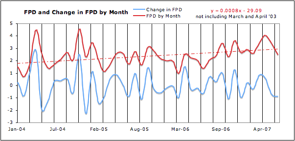 To begin, above is a graph of average FPD from January 2004 to yesterday in red and the month to month change in average FPD in blue. In this view I've cut off everything prior to Jan. 2004 for clarity but it is in there. The red dashed line is a trendline for the average FPD from May 2003 to the present. The trend remains very troubling. I created this graph to highlight how normal a two month change in either direction has been in this conflict. 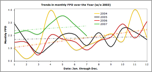 This graph is the average monthly FPD of a years span superimposed on top of one another. 2003 is omitted. The dashed line is the trendline and they are color specific. This graph shows how closely clustered each (yearly) dataset coordinates with other years. You can see the trend cited by Odierno here and how it--although at a level of FPD higher than previous years--appears to be dropping. I highlight this to note that his trend is following previous trends in this time frame. Or it could be a decline that is relative to yearly regional conditions rather than the presidents surge. Perhaps there is there a reason that the FPD metric recedes during the hot summer months year after year? That aside, if Odierno is correct this line will continue to fall and that will provide some evidence that the presidents surge is working to limit the deaths of our troops, although it says nothing about the state of Iraq and the threats posed to the Iraqi population, that's an entirely different graph. This trend could stabilize in coming months placing us back where we were in prior years. Or finally, this trend could follow the trends of prior years and move back up. One hopes that the third scenario doesn't bear fruit. 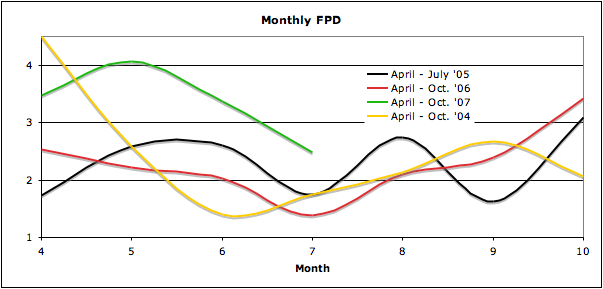  Above is a month-to-month change in FPD of the period of interest. I point this final graph out to show how typical month-to-month trends in the negative are during this time period. I hope that Odierno's vision bears fruit, but to be hyping this belief amounts to a "gut feeling" rather than a legitimate trend. Posted by Geoff 10:37 AM // Blogroll AE // Email // |
B l o g R o l l
Archives |


![[Valid Atom 1.0]](http://i3.photobucket.com/albums/y54/hfiend/valid-atom.png "Validate my Atom 1.0 feed")
